

I’ve always enjoyed creating visualizations.
Here are a few.
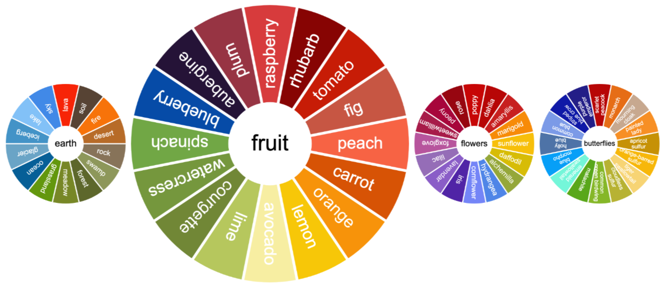
Colour wheels based on butterflies, flower and fruit:
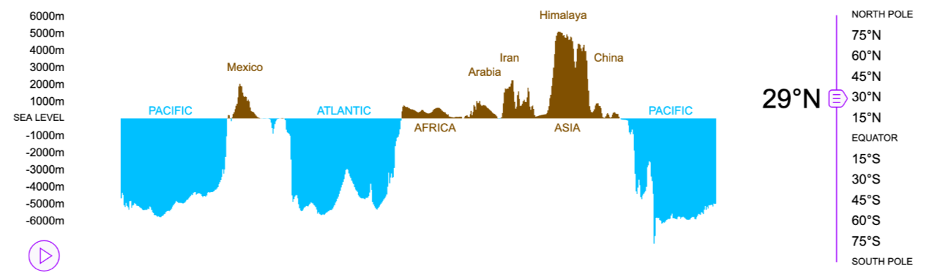
Cross-sections of the elevation of the Earth:
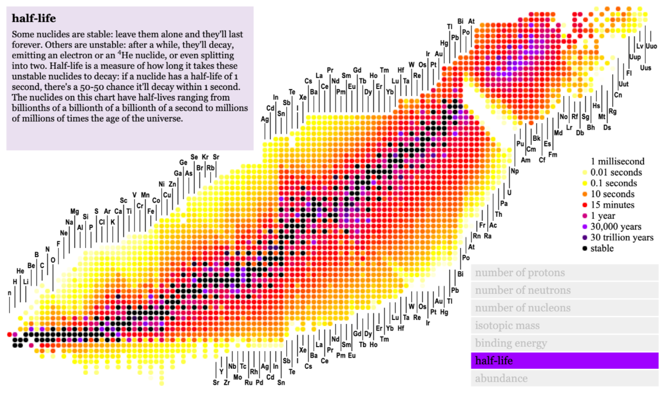
A plot of the nuclei of atoms:
The trouble is, it takes a really long time to create these visualizations: research the topic, collate the data, source the images, design the layout and code the animation.
I’ve long dreamed of a tool that would do all the hard work for me.
So I made one.
All over the place
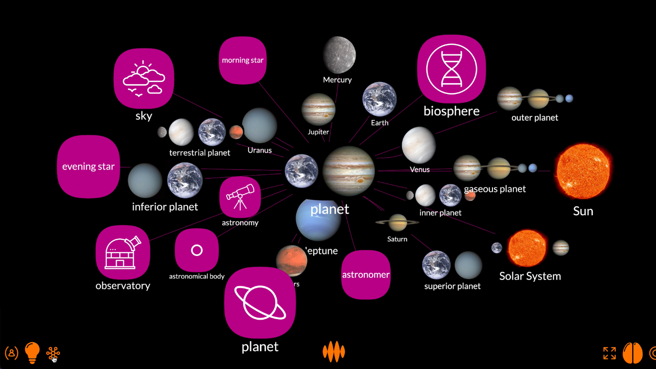
Open Web Mind allows you to visualize nodes... nodes that can represent anything: mountains, colours, people, anything.
It starts out in mesh view.
When you search for something, the nodes appear in a mesh.
So when I search for element, the node representing chemical elements appears, and related nodes appear around it, connected by edges.
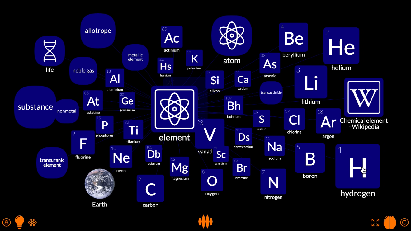
The mesh view is good for exploring these connections in the knowledge hypergraph.
For example, I can fire the nodes for hydrogen and oxygen...
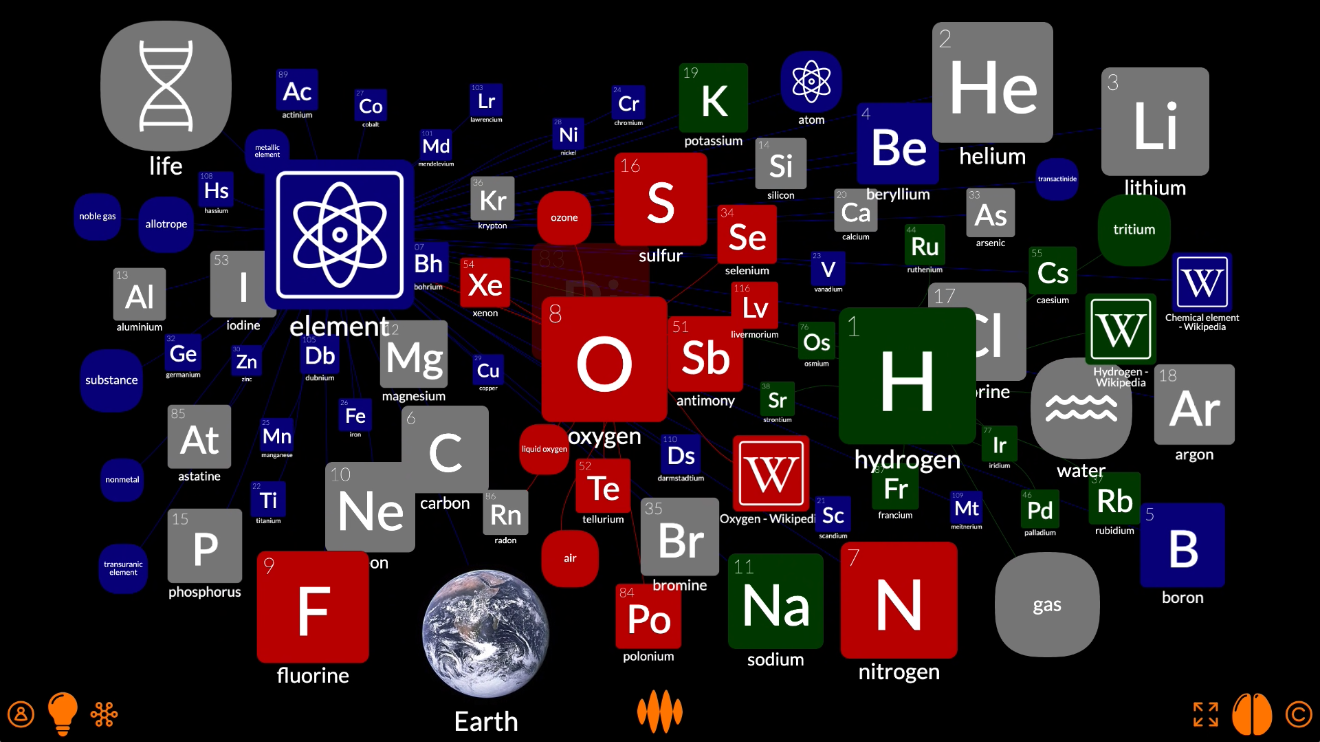
...and find the nodes related to them both, such as water and life.
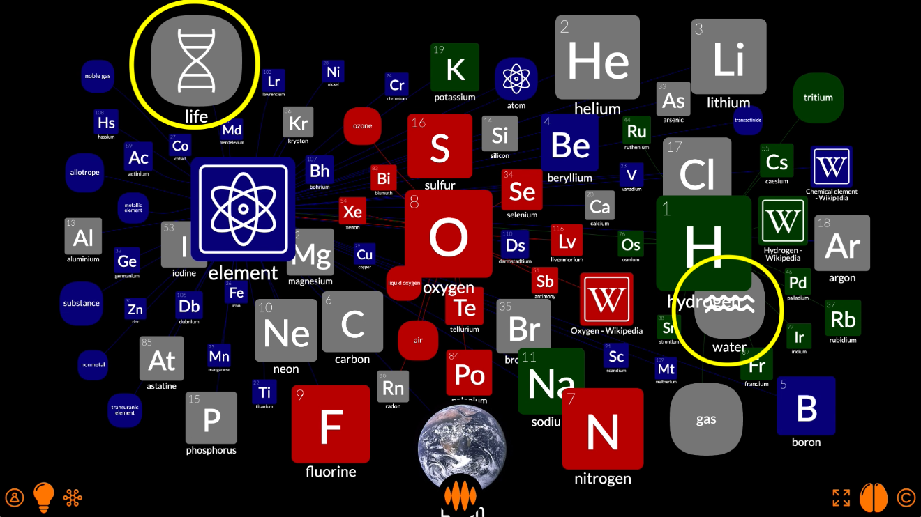
But, as you can see, the nodes are all over the place.
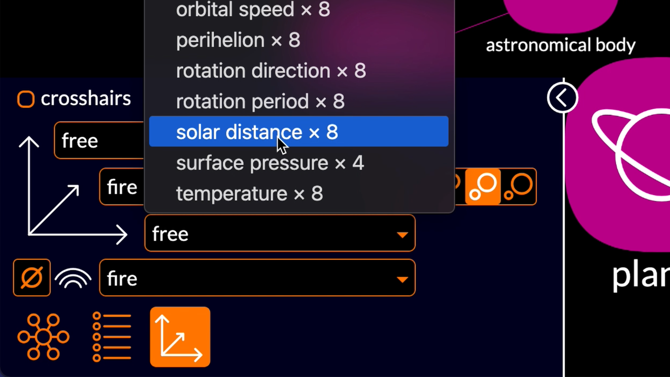
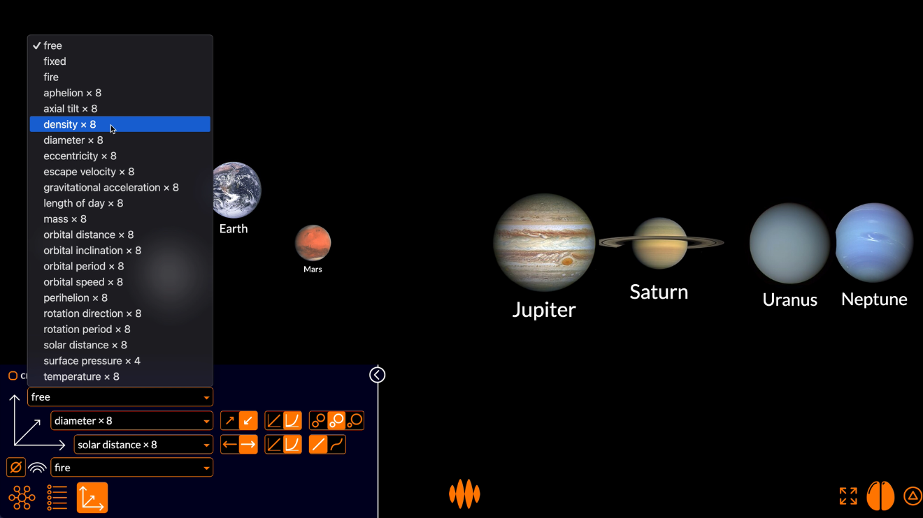
If I want to control precisely where each node appears along x-, y- and z-axes, I can switch to plot view.
Not a plot
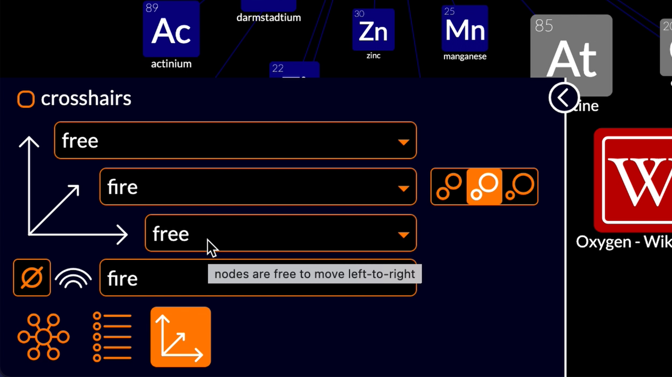
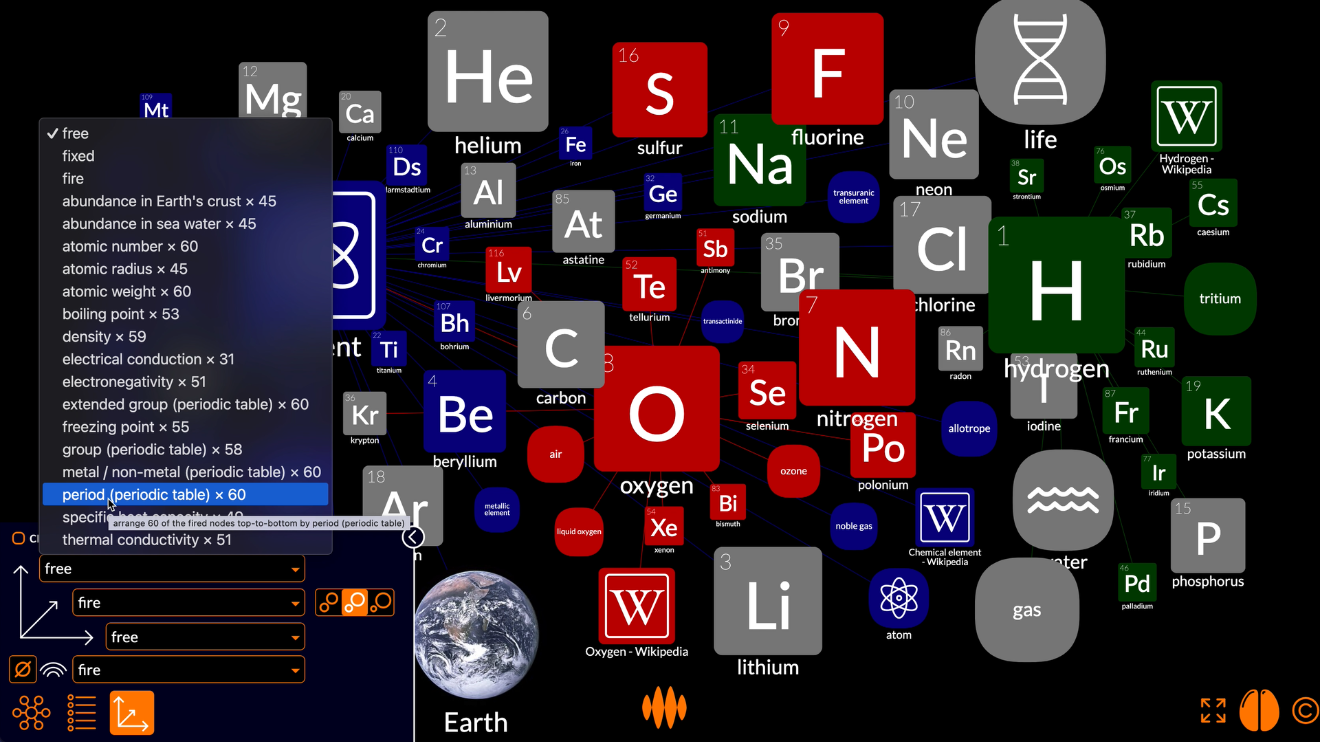
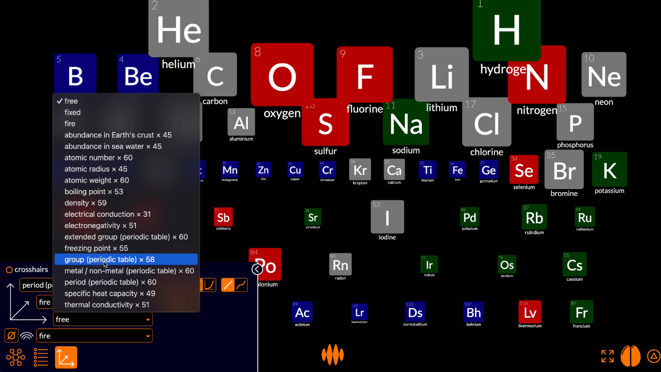
You can see how the plot view settings have given us nodes all over the place.
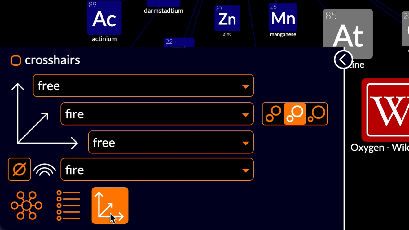
The horizontal and vertical axes are set to free: nodes are free to move top-to-bottom and left-to-right.
The distance axis is set to fire: nodes are arranged near-to-far according to how fire has propagated from the nodes I fired: the nodes representing oxygen, hydrogen and chemical elements.
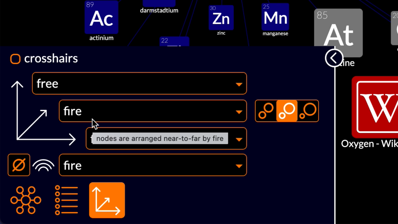
The nodes most strongly connected to those nodes have the most fire, so are shown closest to you, the viewer, which means that they appear larger on your screen. Nodes more weakly connected to the fired nodes have less fire, so are shown further from you, the viewer, which means that they appear smaller on your screen.
The color axis is also set to fire: nodes are colored according to the source of their fire.
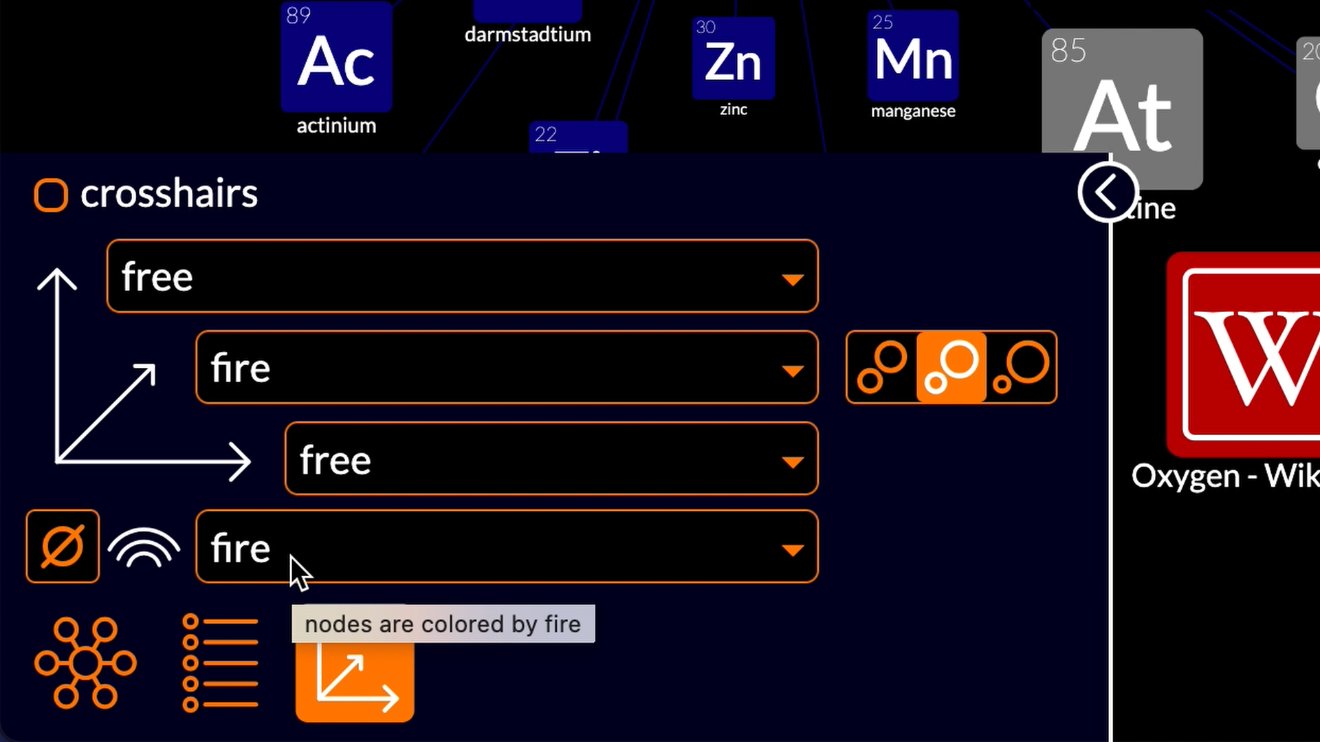
The nodes most strongly connected to oxygen are colored red, the nodes most strongly connected to hydrogen are colored green, the nodes most strongly connected to chemical element are colored blue, and nodes that are more or less equally connected to more than one of the fired nodes are coloured grey.
Tabulate
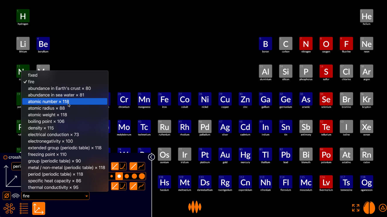
So let’s play with the plot view settings.
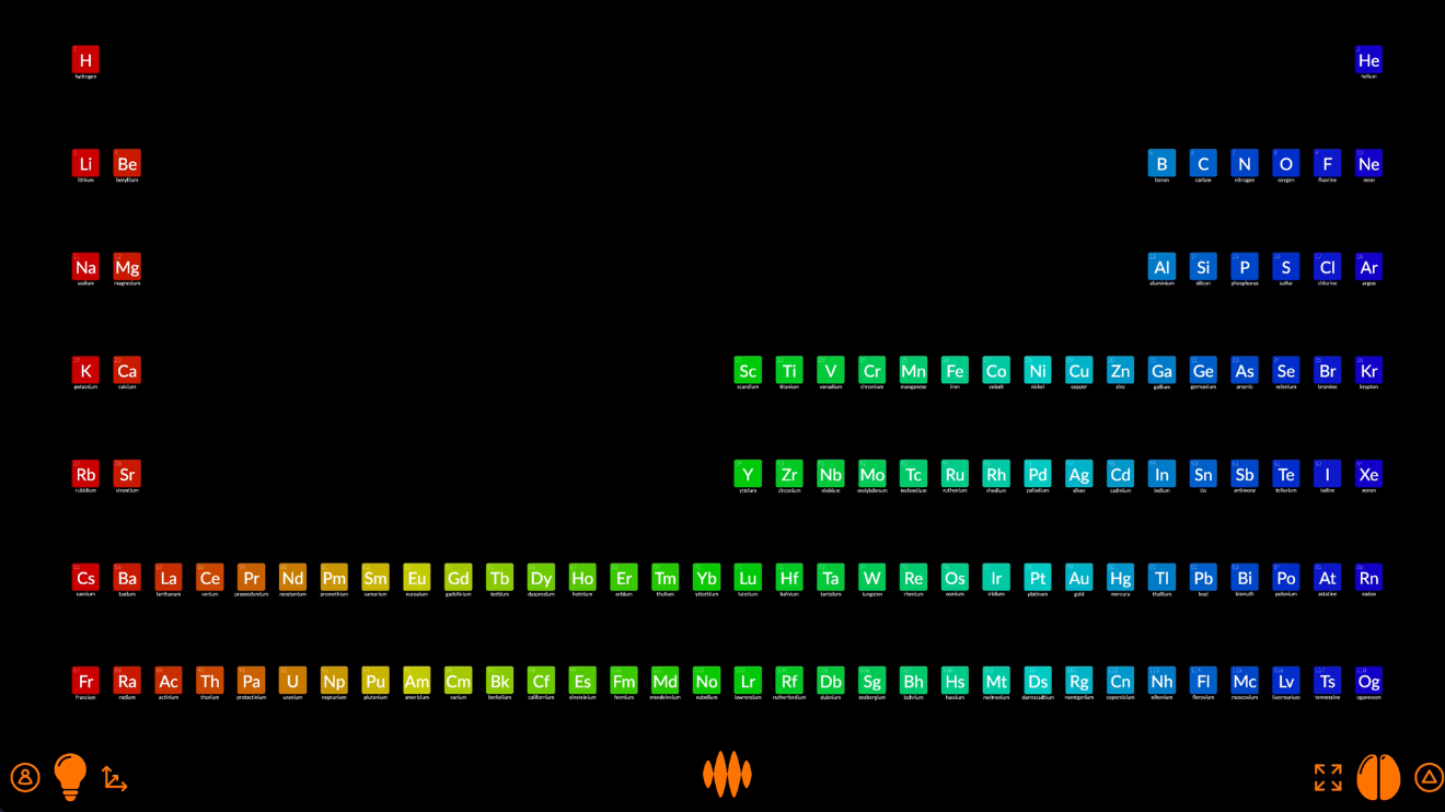
The traditional way to bring order to the chemical elements is to arrange them in a periodic table.
So let’s start there.
In the periodic table, the elements are arranged top-to-bottom by period. If I tap the vertical axis selector, you can see that the Open Web Mind thinker has already noticed that 60 of the fired nodes have the property period.
When I select that property, a couple of things happen.
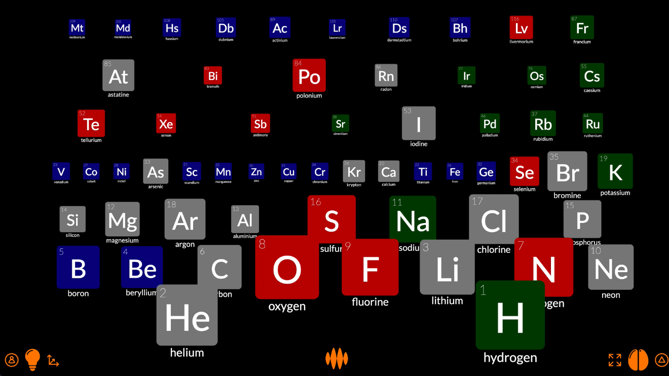
Any nodes that do not have a value for the property period disappear – the nodes representing atoms, water, life, Earth – leaving only the nodes representing elements – lithium, carbon, sodium, chlorine.
And those nodes are arranged top-to-bottom by period.
Actually, they’re arranged bottom-to-top, which is the wrong way around. The periodic table has hydrogen and helium at the top and the heavier elements at the bottom. Let’s fix it by tapping the top-to-bottom button.
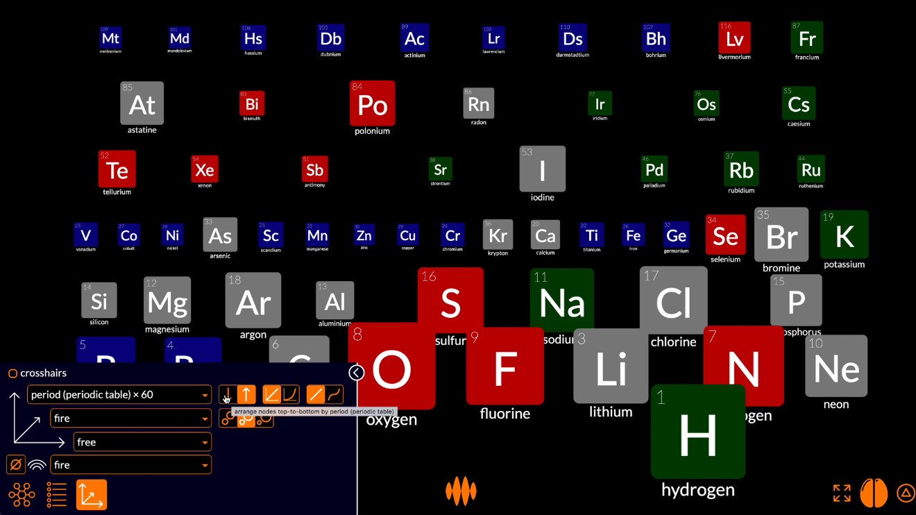
The nodes at the bottom have now moved to the top and the nodes at the top have moved to the bottom.
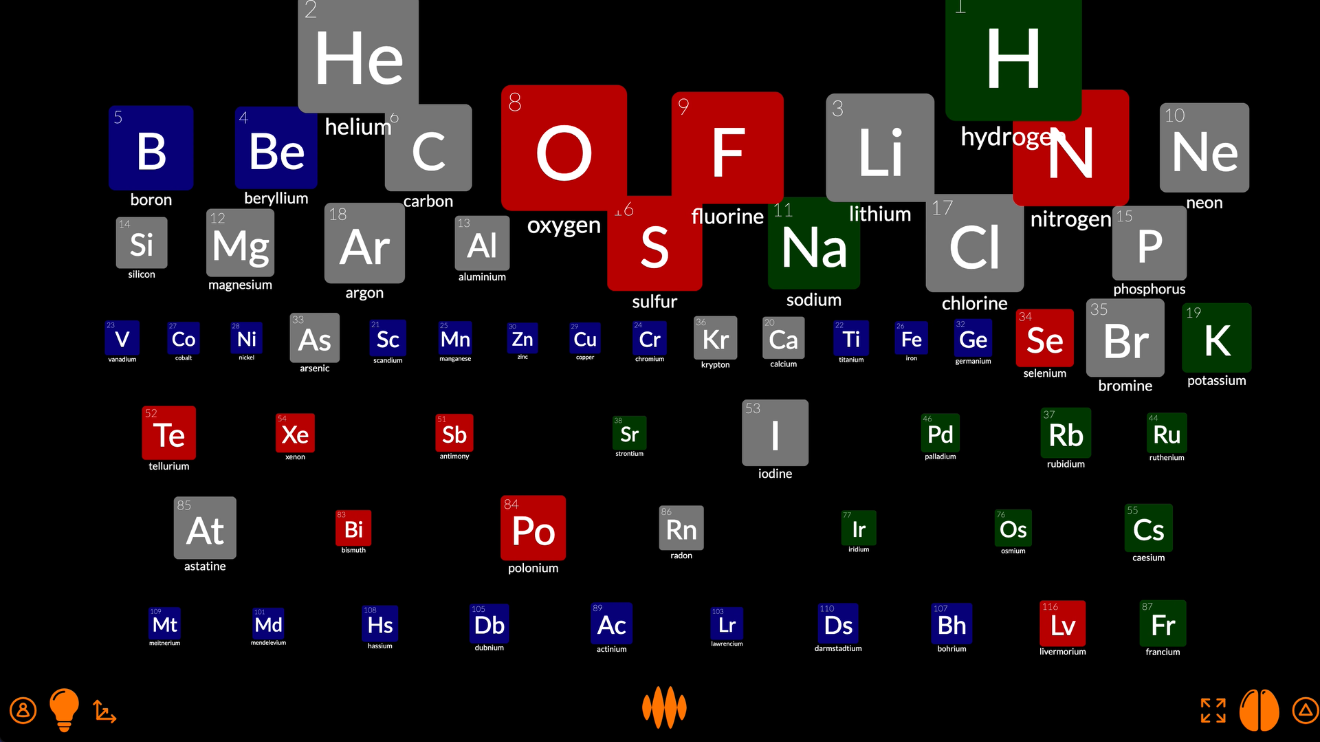
Now let’s arrange the nodes left-to-right by group, using the horizontal axis selector.
The nodes are now arranged top-to-bottom by period and left-to-right by group.
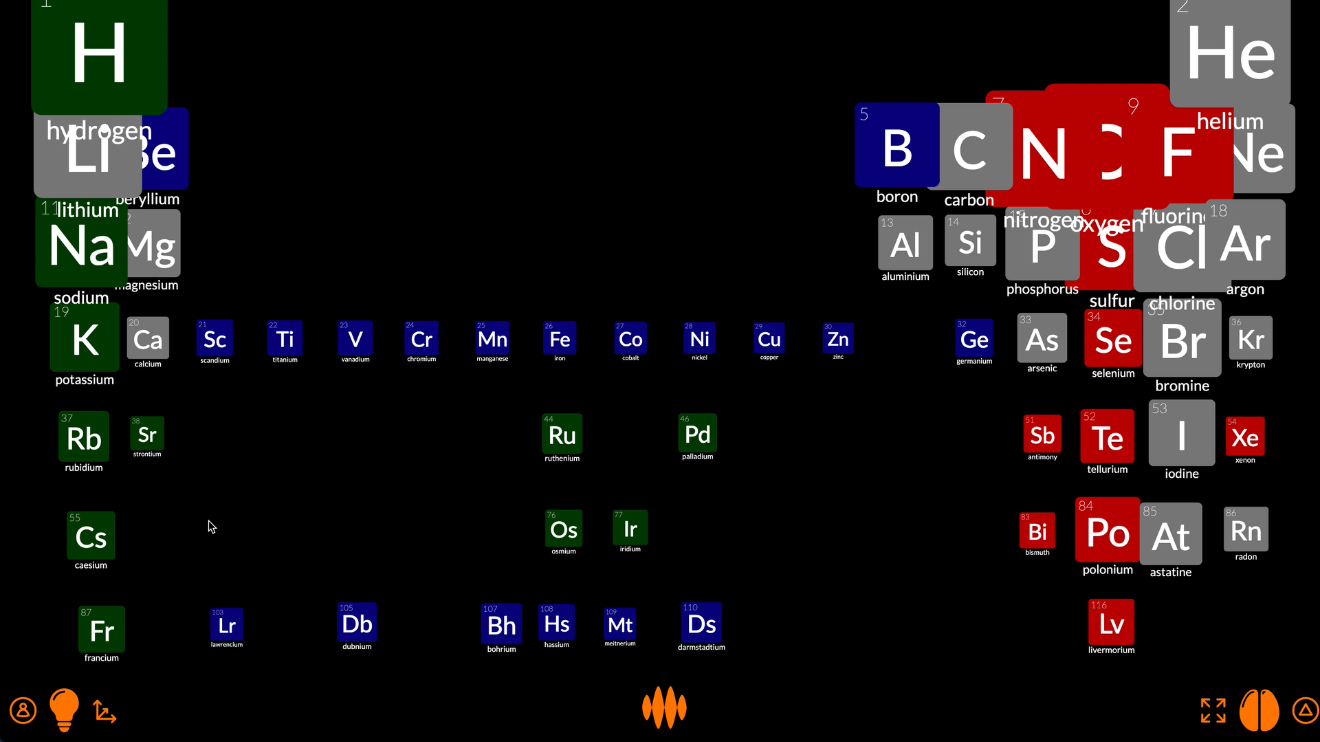
It looks like we don’t have all the elements yet, so let’s re-fire the node representing chemical elements.
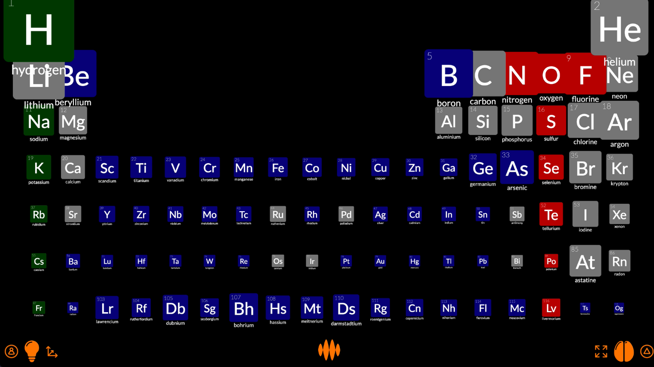
That’s looking a lot like the periodic table.
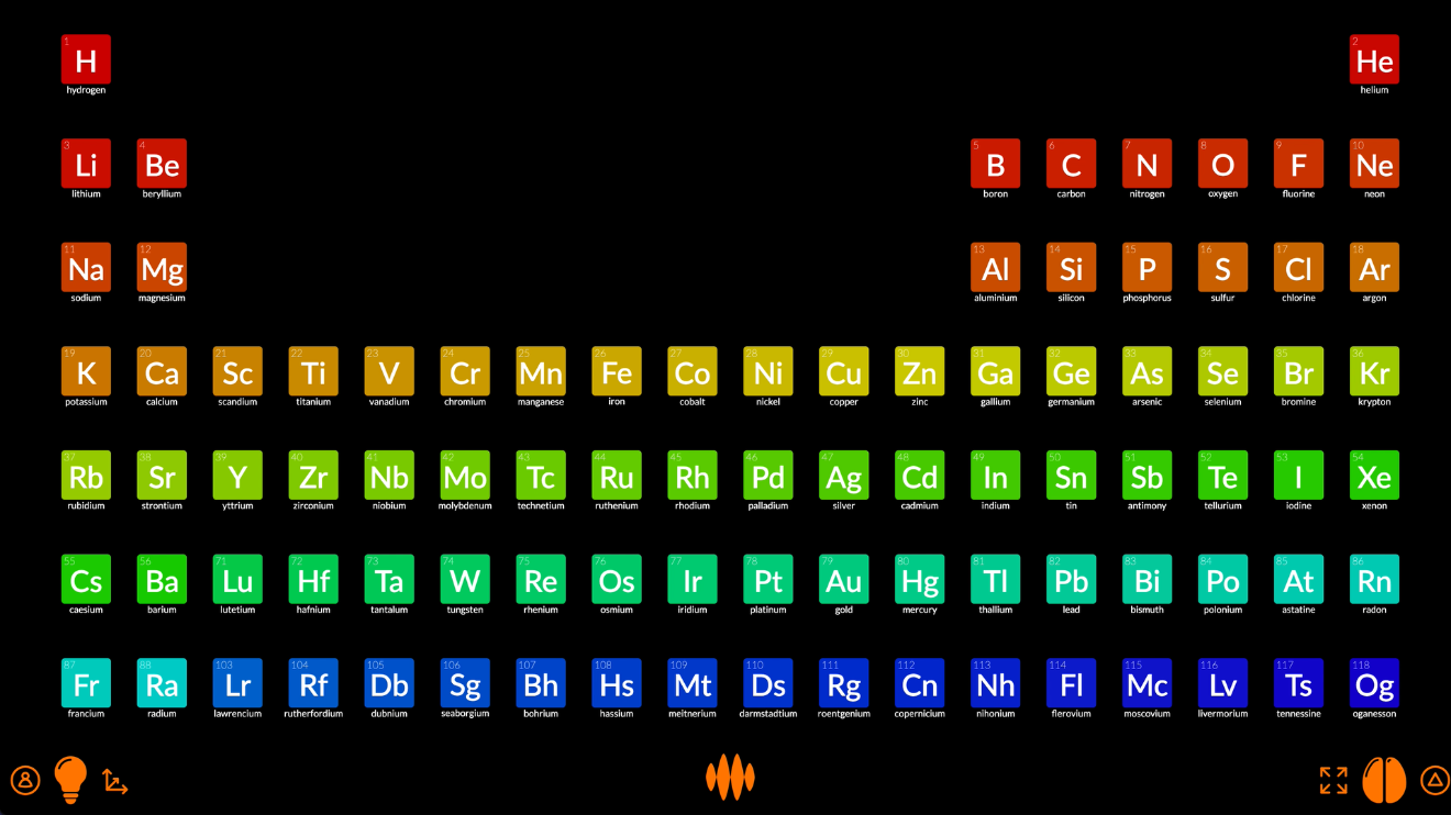
The elements are different sizes because the nodes are still arranged near-to-far by fire. We can make them all the same size by setting the distance axis to equal.
That’s better.
And they’re still colored red, green, blue or grey depending on whether they’re most strongly connected to oxygen, hydrogen or chemical element. We can color them more meaningfully by setting the color axis to the property atomic number:
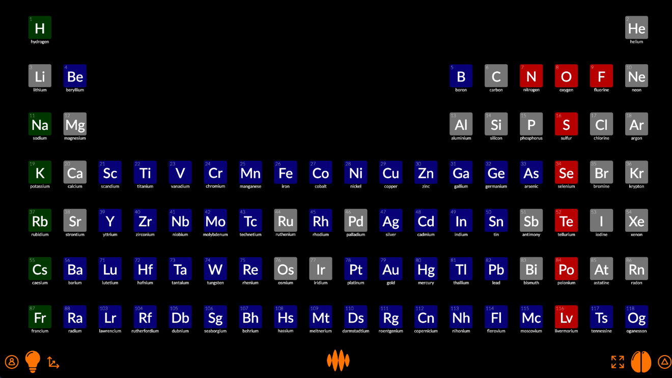
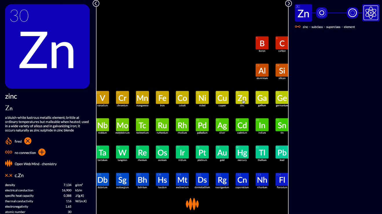
And there we have it, the periodic table...
...with pop-up details for each of the elements.
This is not a ground-breaking visualization. It’s the same as countless other periodic tables you’ve seen on the web.
What’s ground-breaking for me, as a veteran creator of visualizations, is that it didn’t take me any time... to research the topic, collate the data, source the images, design the layout and code the animation.
Open Web Mind did all the hard work for me.
Plotify
And that’s just the start of it.
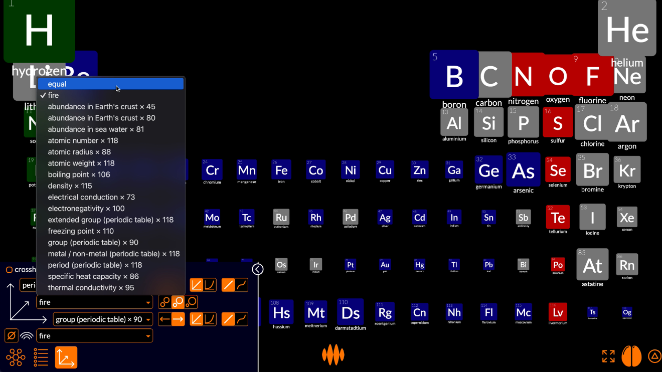
The periodic table is not the only way of arranging the elements.
If I select density on the vertical axis and atomic number on the horizontal axis, and reduce the size of the nodes a little...
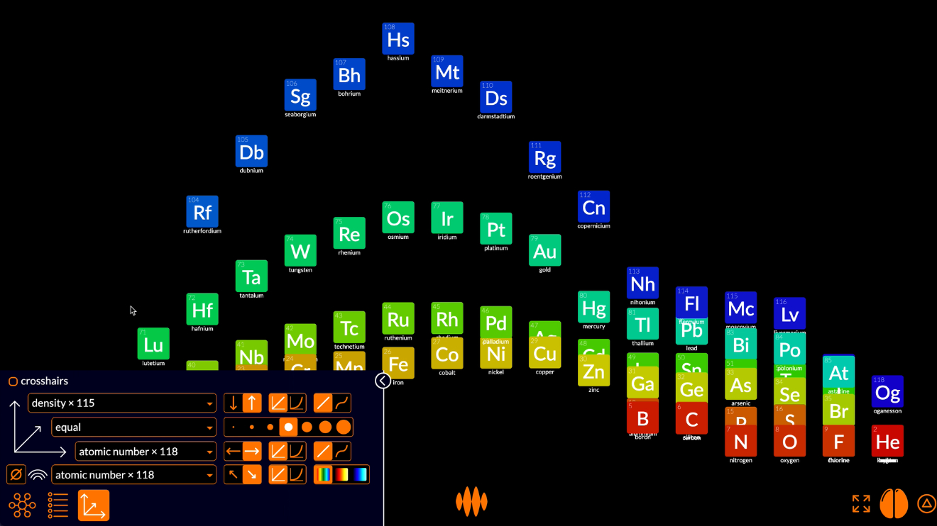
...we get a plot of density against atomic number.
This is a fascinating plot. Why is it so spiky? Why doesn’t the density of an element simply increase with the weight of the atom? I mean, hydrogen is a really light atom, with its single proton, and uranium is a really heavy atom, with its 238 protons and neutrons, so why doesn’t density increase linearly from lighter-than-air hydrogen to heavier-than-lead uranium?
The answer lies in the different ways atoms bind with each other, depending on what group they’re in. Radon is a heavy atom, with 222 protons and neutrons, but radon atoms don’t bind with each other, so they form a gas, which is light. Copper is a much lighter atom, with 64 protons and neutrons, but copper atoms bind tightly with each other, so they form a metal, which is quite heavy.
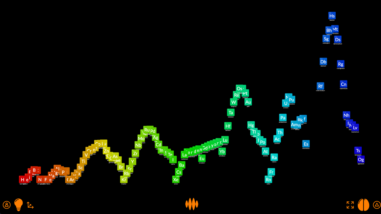
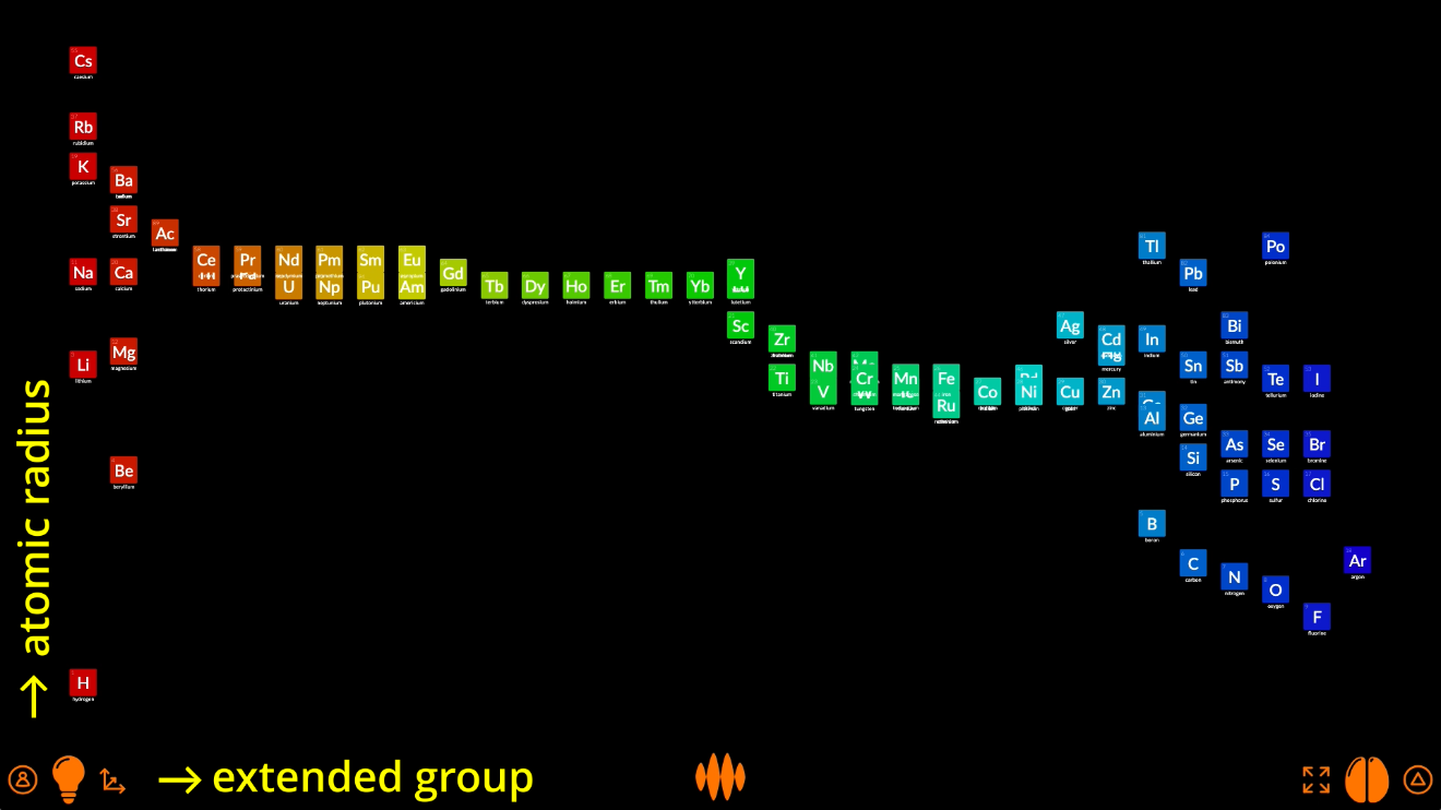
If I color the elements by extended group, we can begin to see how this works.
The red and dark blue elements are in groups that bind loosely with each other, so are less dense. The orange, yellow, green and light blue elements are in groups that bind tightly with each other, so are more dense.
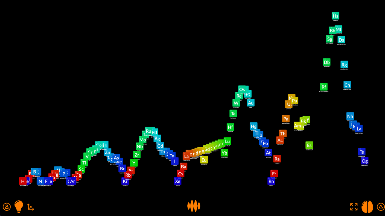
If I rearrange the nodes into an extended periodic table...
...you can see that those loosely-bound elements, the red and dark blue ones, are in the groups at either end of the periodic table, while the tightly-bound elements, the orange, yellow, green and light blue ones, the metals, are in the groups in the middle.
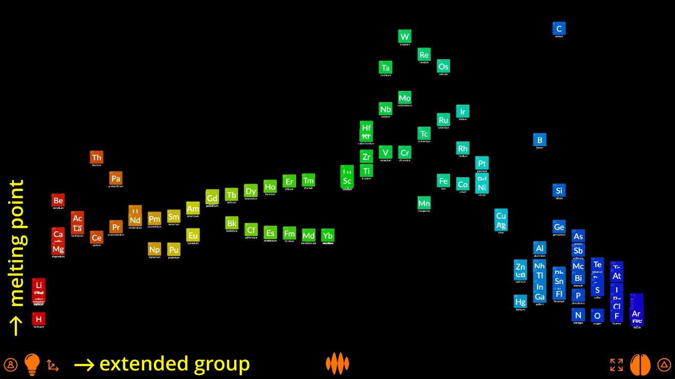
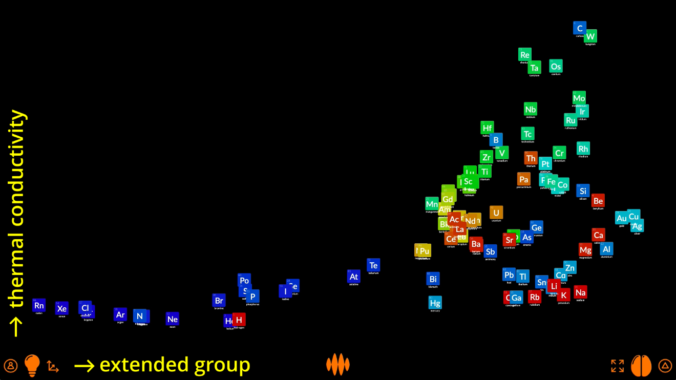
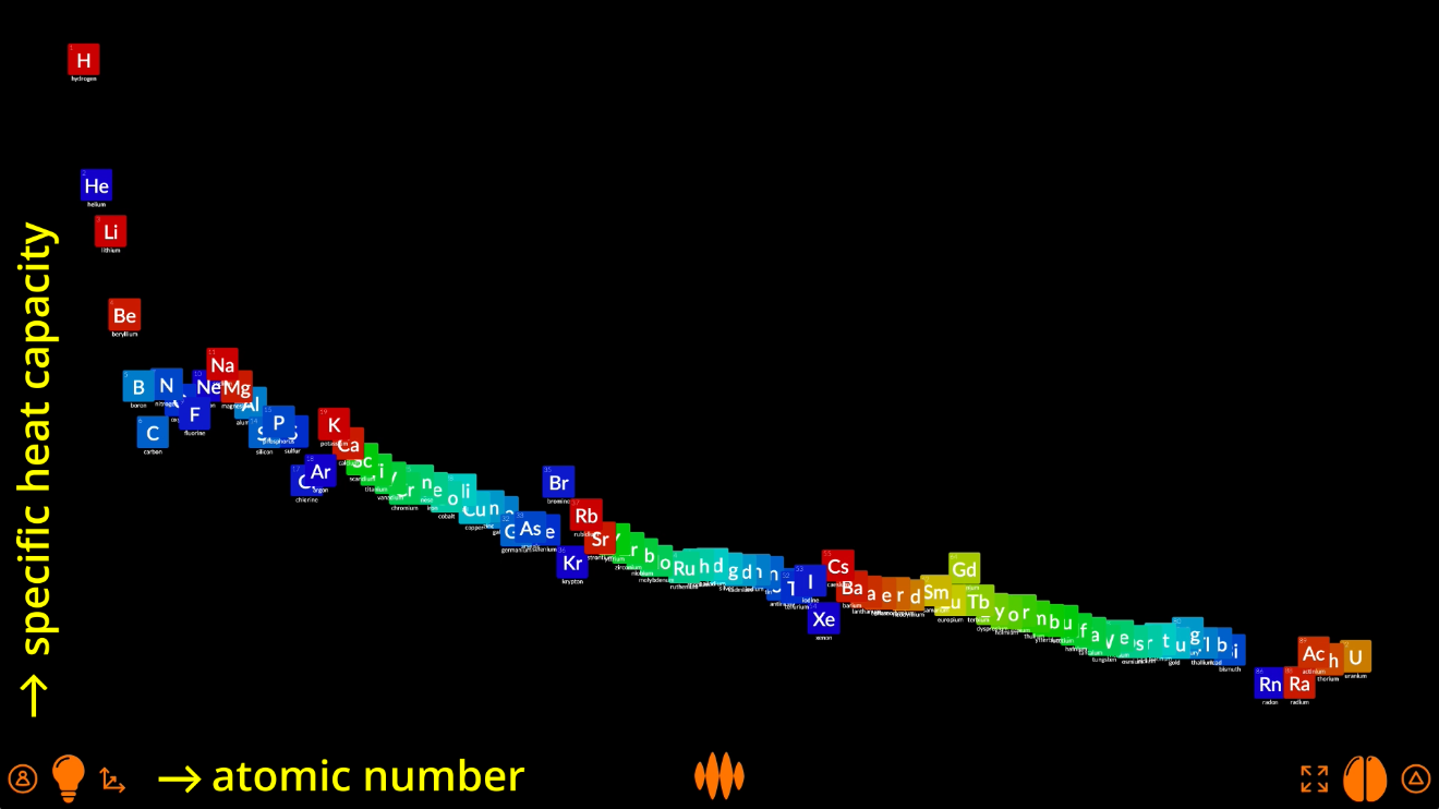
Open Web Mind lets you play around with these plots endlessly.
You can plot the elements’ atomic radius:
Or melting point:
Or thermal conductivity:
Or plot specific heat capacity against atomic number:
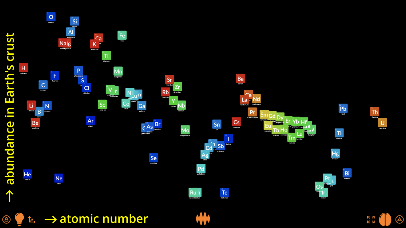
Or even the abundance of the elements in the Earth’s crust:
And elements are not the only things you can plot.
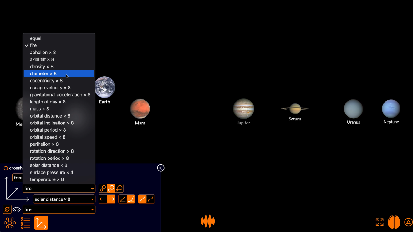
Any number
In Open Web Mind, you can plot anything by any values.
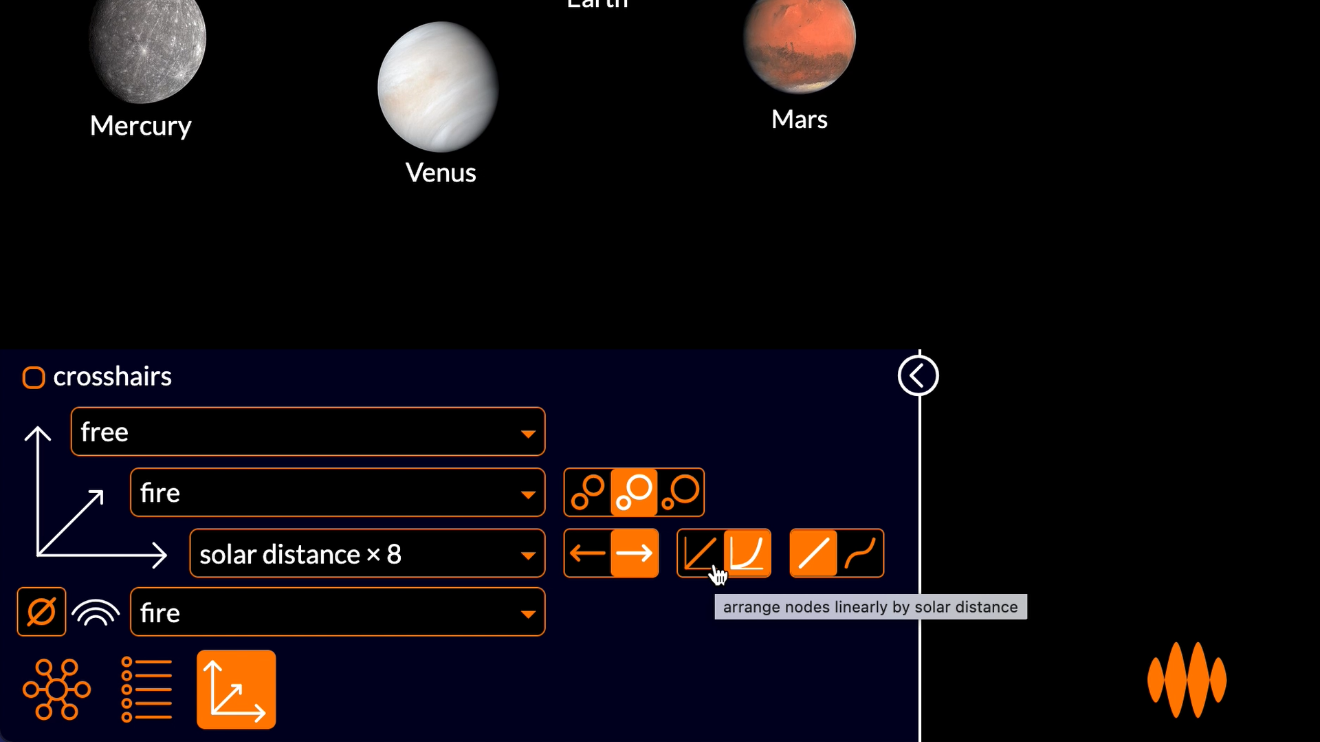
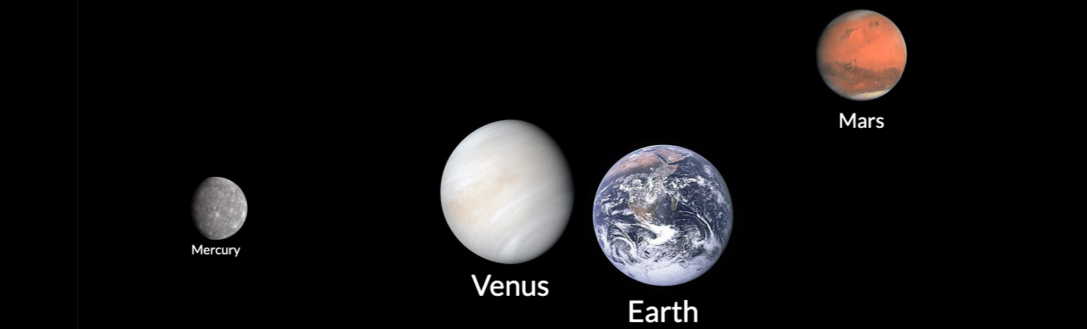
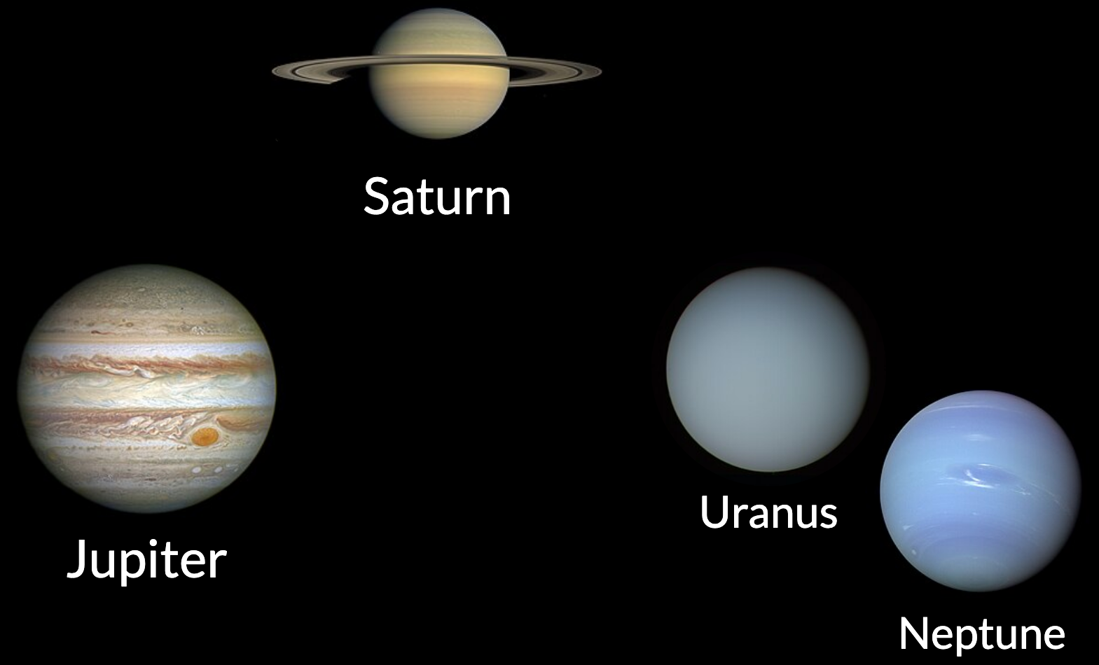
If I search for planet...
...I can arrange the planets of the Solar System by their distance from the Sun:
The planets closer to the Sun are plotted to the left and the planets further from the Sun are plotted to the right:
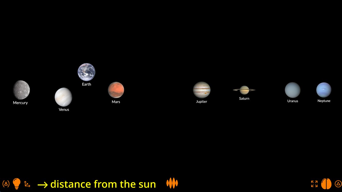
You can see that the Open Web Mind thinker has automatically selected a logarithmic axis, since the distances of the planets from the Sun increase exponentially, more or less.
I could switch to a linear scale...
...but then the terrestrial planets are crowded close to the Sun, while Neptune is way out there on its own...
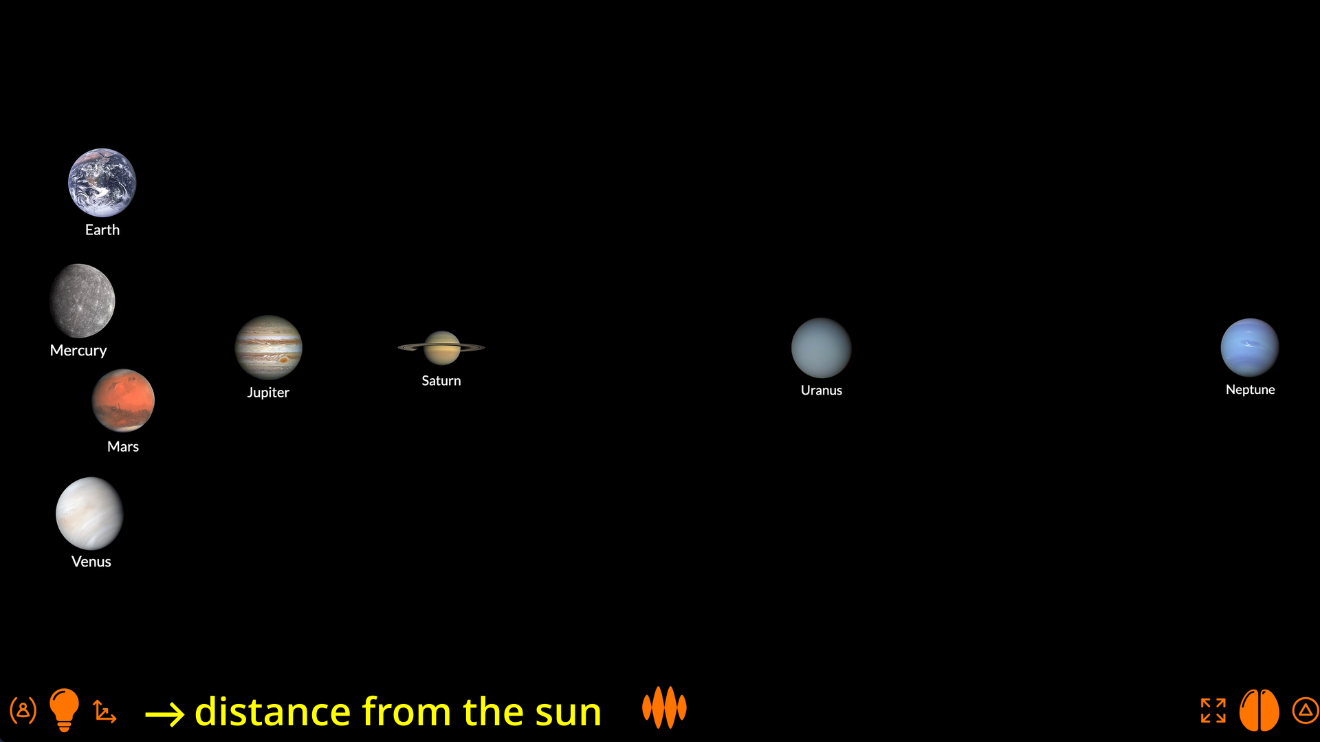
...so the logarithmic scale makes more sense.
It also make more sense to show small planets small and big planets big, so let’s set the distance axis to diameter:
Again, the thinker automatically selects logarithmic axis.
This plot is obviously not to scale, but it does feel better to see Mercury small and Jupiter big.
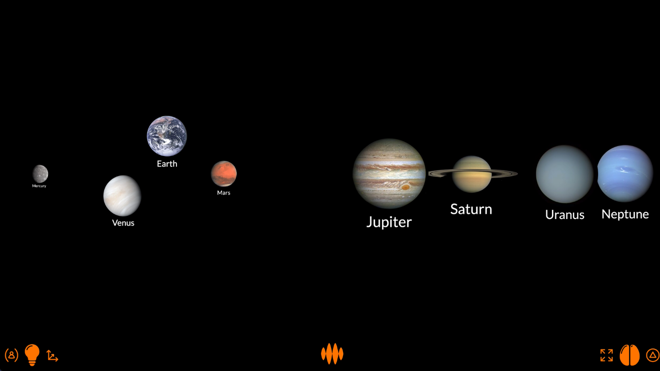
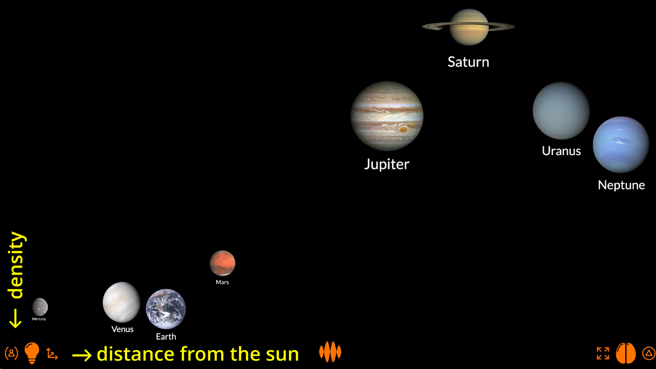
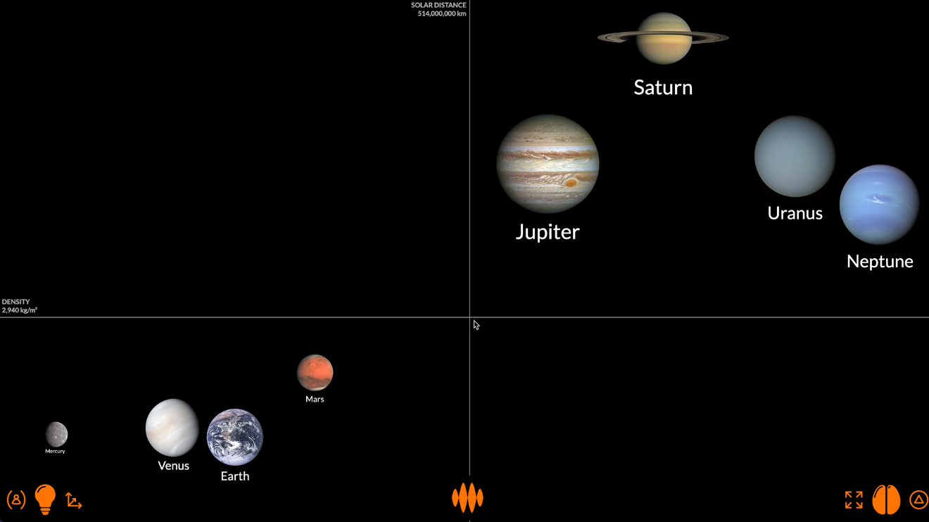
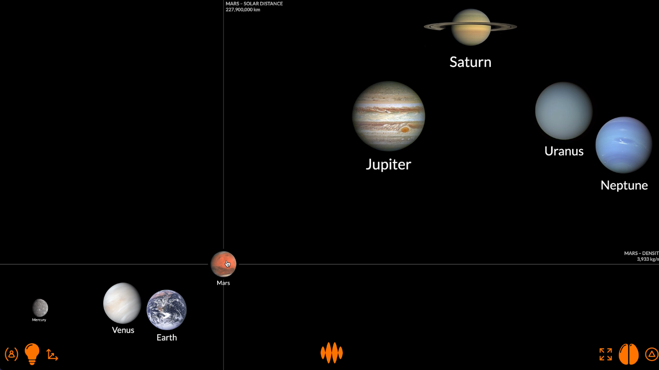
Now let’s see how the density of the planets varies with their distance from the Sun.
I’m going to show denser planets at the bottom and less dense planets at the top.
The crosshairs show you the numbers: the density and the distance from the sun at any point on the exponential axes.
Hovering over a planet shows you the numbers for that planet: the density of Mars is 3,933 kg_m3, and it’s 227.9 million km from the Sun.
The plot doesn’t tell you anything you didn’t already know.
The terrestrial planets – Mercury, Venus, Earth and Mars – clustered in the bottom-left corner are all small, dense and close to the Sun.
The gaseous planets – Jupiter, Saturn, Uranus and Neptune – clustered in the top-right corner are bigger, less dense and further from the Sun.
What Open Web Mind does for you is make this clustering visual.
You already knew that Mercury, Venus, Earth and Mars are different from Jupiter, Saturn, Uranus and Neptune, but the visualization helps you really see the differences.
Again, Open Web Mind lets you play around with these plots.
You can plot the planets’ temperature...
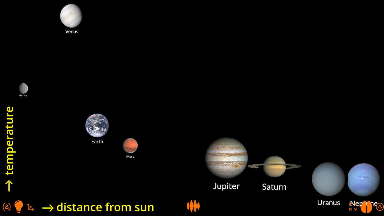
...and see that there’s a predictable trend – planets closer to the Sun are hotter, planets further from the Sun are colder – with the notable exception of Venus, whose dense atmosphere makes it much hotter than you’d expect.
Or you can plot eccentricity...
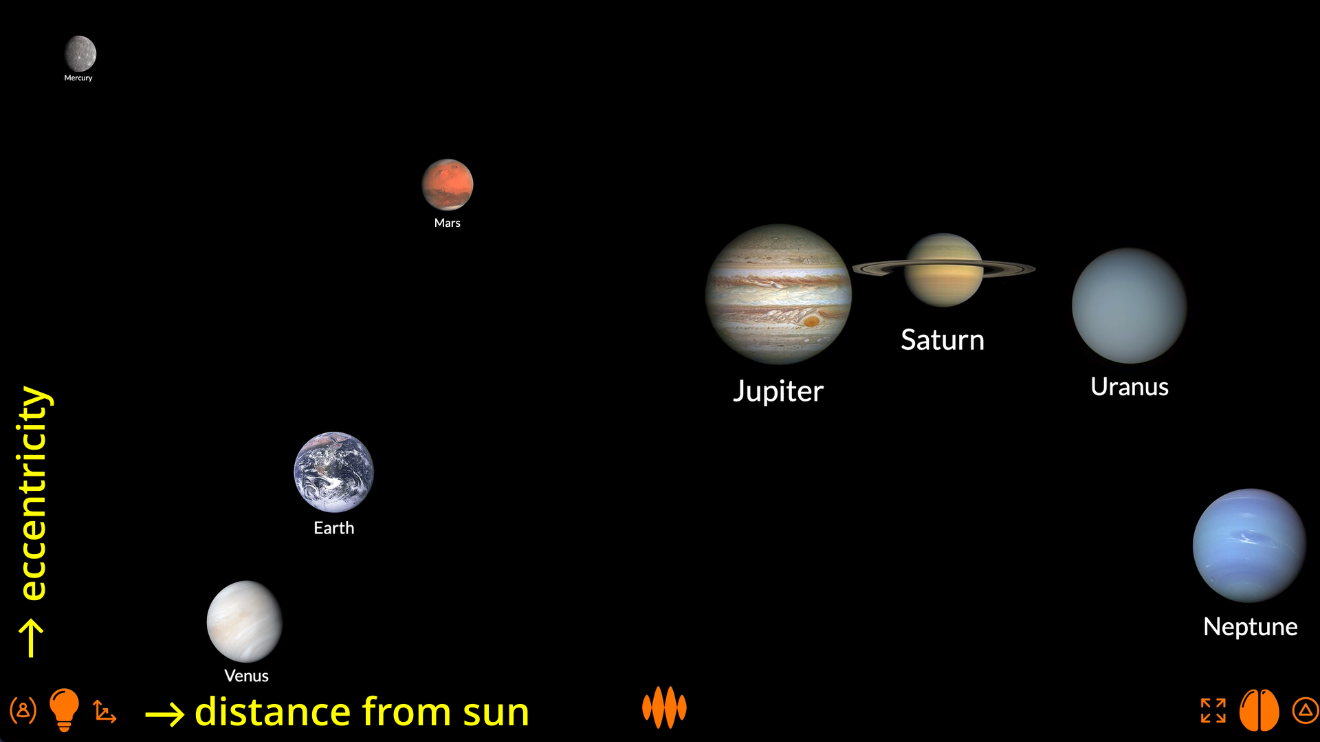
...and see that there’s really no relationship between the eccentricity of a planet’s orbit and its distance from the Sun: Mercury has the most elliptical orbit, while its next-door neighbour Venus has the most circular orbit.
Playing with fire
It’s the playing that’s the point.
Sure, I can discover an insight for you, and you’ll get something out of the visualization I create...
...but if you discover the insight for yourself, you’ll get so much more out of the visualization you create.
Open Web Mind doesn’t just help you see.
It helps you think.
—
Sources
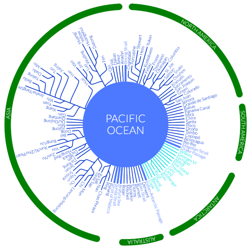
- River and glacier geography from Harvard University – Centre for Geographic Analysis – World Rivers, Wikipedia, OpenStreetMap and Earth Sky – First complete map of ice flow from heart of Antarctica
- Combined elevation and bathymetry data from National Oceanic and Atmospheric Administration – National Centres for Environmental Information – ETOPO1 Global Relief Model Amante, C. and B.W. Eakins, 2009. ETOPO1 1 Arc-Minute Global Relief Model: Procedures, Data Sources and Analysis. NOAA Technical Memorandum NESDIS NGDC-24. National Geophysical Data Center, NOAA. doi:10.7289/V5C8276M. Accessed 16 February 2019
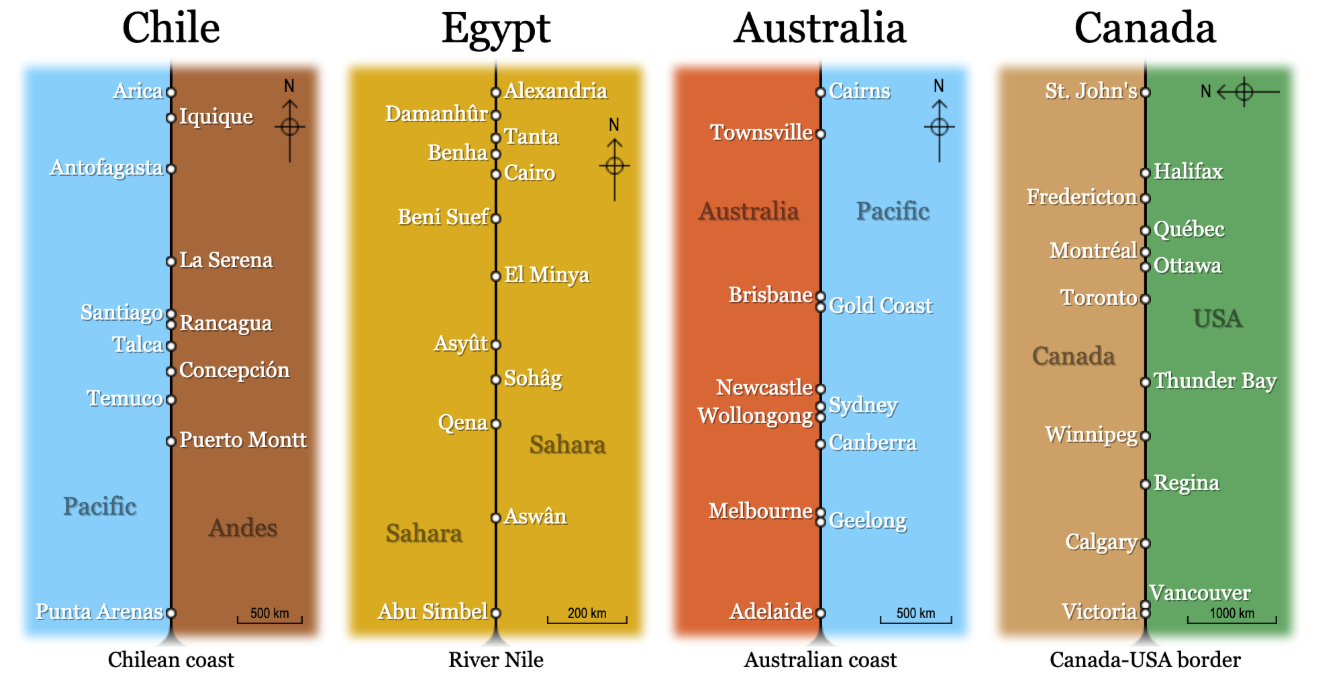
- Distances between cities from DistanceFromTo
- Nuclide data from Wikipedia – Table of nuclides, Wikipedia – Isotopes of hydrogen, helium, lithium, etc., Wikipedia – Hydrogen, Wikipedia – Neutron, Wikipedia – Atomic mass unit, Brookhaven National Laboratory – National Nuclear Data Center – Atomic Mass Adjustment, University of Waterloo – Chung Chieh – Nuclide Stability and National Institute of Standards and Technology – Fundamental Physical Constants
Credits
- Wordings from WordNet created by Princeton University licensed under WordNet 3.0 license
- Wordings from Wikipedia created by Open Web Mind reader licensed under CC BY-SA 4.0 according to Wikipedia license notice
- File:OSIRIS Mars true color.jpg – Wikimedia Commons created by ESA & MPS for OSIRIS Team MPS/UPD/LAM/IAA/RSSD/INTA/UPM/DASP/IDA licensed under CC BY-SA 3.0 IGO according to ESA content conditions of use


